— inspired by my new favorite blog, littlebigdetails.com —
In a lot of ways, Amazon’d kindle feels like an Apple product: thin, lightweight, easy to use. And yet in a lot of others, its early adopter / geek toy nature still shines through.
Case in point: The changes to the status line in the latest kindle software update.
Previously, the very bottom of the display would show your progress through the book using a thin line, with dots for chapters. Above it, you would see the current percentage read, the current “location” (kindle’s page number substitute), and the total number of locations in the book.

With the new software update, amazon introduced real page numbers.
Besides the kindle-esque location, they now show you the real page number, i.e. the page you would be on if this was the physical book, and the total number of pages (see image below).

But now, somebody started thinking about usability. Doesn’t the bottom of the screen look a little busy now? Do we really need all this information? After all, the kindle is supposed to be about reading, not showing metadata.
So the image above is actually only shown if you press the menu button, and have the kindle’s system menu on screen. Which is great – you can see the information when you want it, but it stays out of your way otherwise. And pressing the menu button is already established on the kindle as a means of calling up additional data, since the title bar with book title, battery indicator and time is also only shown when the menu is on screen. Pretty sweet.
So what do you have on screen when the menu is NOT activated?
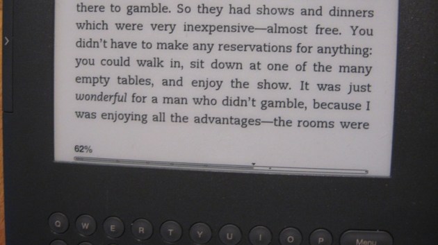
Well, they got rid of the page numbers, and the location numbers, thereby freeing up more space for actual book text, while the shaded bar still gives you an indication of where about in the book you are.
Unfortunately, the kindle UI team managed to snatch defeat from the jaws of victory. Because there actually is no space freed up, since while the pages and locations are gone, the percentage is still there (see below). Which is utterly pointless, since the shaded bar at the very bottom contains the same information (About where in the book am I?). Granted, the percentage is a little more exact – but not exact enough to find your place again – for that you would need the location number…

To add insult to injury, now that the percentage is the only text left in the status bar, it’s stands out even more, and is probably more distracting than the combined information shown before.
So the good news is amazon thinks about usability, and strives for clean, distractionless design. The bad news is, they are not yet quite as good at it as Apple.
Sorry to nitpick like this, the kindle is a great product in general (full review to come), I just found it a neat little example of making UI decisions.
